

Abecedaria Press · Cursive — Igbo
Lesson 30

In this example, we have the f from the typeface. Because it's made for printing in a book, it's a bit squashed at the top and the bottom. But the f as it was written, when it was not being bothered by printing presses, was much taller. It went up much higher, like a rocket ship, and went much deeper, like a submarine. But the shape is the same.
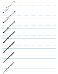
So I'm going to describe the shape to you. We start off just as if we are making an h, or a k, or a b: exactly the same shape. So we take our line up, and then we come down straight, as if we're making an h, and we keep going all the way down, just as if we were making the bottom line of the q. So if you think about it, it's like an l combined with the bottom of a q, and that's the f. We have both of those letters, and we've done both of those shapes, so there's nothing here that's new. So we go up, we curve, we come down, and then we make the forward loop and touch, and away, just as though we were making the bottom of a q. So this is a combination of the top half of a k, or the top half of an h, or the top half of a b, with the bottom part of the q. And that gives us the letter f.
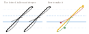
This letter looks better if it's slightly taller than shown here, and slightly longer than shown here.
Cursive — Igbo — Part One: The Small Letters · Evan Millner · Published by Abecedaria Press