

Abecedaria Press · Cursive — Igbo
Lesson 7

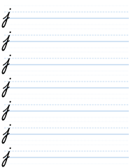
Right, next, we're going to do the letter j. Now, the example you have in front of you is from a typeface, and it's not handwriting. So I'm going to make a couple of observations about it to improve it, because it's not as good as it could be.
So we start off the same way we did at the very, very beginning. We go light up and dark down, just like we did before we learned the letter i. But then we keep going down. And you can go down quite far. You can go down further than just one line. In fact, you should go down further than one line. Otherwise, this letter doesn't look so good. You will be able to assess from your own judgment how beautiful it is. But if it's too short, it looks a bit stubby and unpleasant, like in this example. It should go down further.
So we go light up, we go down, like a submarine goes under the sea. Now remember, downstrokes go down like a submarine, and there's a tendency to make them too short. Better to make them long.
And then we make the curve, and we come up. Now, the angle of the curve on the example, that is wrong: it's not steep enough. It needs to be the same angle as the upstroke of the i. Because what we're going to do is we're going to go j, and then we're going to draw straight afterwards an i. And you will see that the angle of the upstroke of the j needs to be the same angle as the angle that begins the j, if you understand what I mean. All the angles need to match.
So try to do a line of j's. Make them as long as you want, but keep them the same length.
Sometimes when you write in cursive, you do have to vary the length of things, because letters poke down and cover letters below. But when people did write cursive, they didn't bother about that so much, and they were quite happy with letters going below the line into the line of letters that you're writing below, and they could read it quite well. So don't worry about that. Everything will be quite readable, even if that happens.
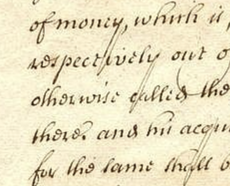
Here is an example of what I was talking about, from Sir Christopher Wren, who was the architect of St Paul's Cathedral in London. And as you can see, the downstrokes of some of his letters are very long. And also note the spacing between the lines is quite a lot. It's almost a double space between the lines. And that makes, of course, the letter very easy to read.
And people would write on blank paper, and sometimes they would have a lined paper underneath, so the lines could be faintly seen through, or they would just write without lines, because after much practice you don't need them, especially with cursive. Cursive tends to help you keep things on the line, because all the letters are joined up.
So as you can see, your downstrokes can be quite long; not excessively long. I mean, here they are very long, but not so short. The reason why they are short in the example we have here is that this is a typeface made by a computer for printing in a book. And printing in a book doesn't work if the letters go down over the line to the line below. It's not possible to do that if you're printing. But if you're writing by hand, of course, it is.
Cursive — Igbo — Part One: The Small Letters · Evan Millner · Published by Abecedaria Press