

Lesson 31
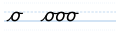
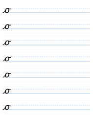
Here we have the letter o, which is quite a difficult letter to draw. You can make it very round, as it's shown here, or you can make it more of an oval, a narrower shape. If your writing is sloping forwards, then your o will tend to be a bit narrower, just naturally.
So what we do is, we start at the bottom and we go up as if we're making an i, and we curl a little bit, as if we're making a slightly bent i, the kind of i you're not supposed to make. And then we come back on that same line, so it's like a shallower c, and we get to the bottom, and we curve up and bring it up to join the top, and then we tick away. And that is the letter o. The o always has its final tick, even when it is the last letter; it is never without it.
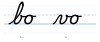
If we have a letter in front of the o that has its joining stroke higher up, for example b, then we bring that across to the top of the o, and we start our curve backwards from there. And we go all the way around, and then we tick away forwards.
Cursive — Part One: The Small Letters · Evan Millner · Published by Abecedaria Press