

Lesson 9

The next letter we're going to do is the letter y. And here you will see exactly why we dot our i's and dot our j's: because if you were to dot the tops of the letter y, it would suddenly turn into ij. Just magic.
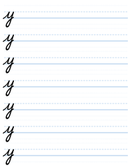
So how it works is this. You go light up, dark down, and then you flick away just as you hit the bottom, and you keep going up straight, and then you come down straight and make a j. And then you curve, and then flick away in a straight line, ready for the next letter.
So the printed j in the y that's here has got a squiggly line for its light up. It should be straight. And as I said, it should be longer than what we have here. So make it longer, because it looks nicer if it's longer. And your eye will tell you when it's the length that you find beautiful. If it's too long, it might look a bit ridiculous, but you might like it. But too short does not look good.
So we make the letter y. Make a row of letter y's, and do that for a page until you can get them right. Make sure that the tops of the y's are the same height. So the first one and the second one: the two tops must be the same height.
There is a tendency that, as you write, the next thing you write gets shorter than the thing you started with. This happens to a lot of people who are learning how to write. I've taught many, many students how to write, and I have noticed that this happens over and over again. So I'm warning you about it now, so you can look out for it.
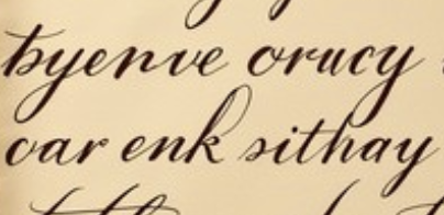
In this example from an old letter, you can see three y's, and you can see that they are longer than the y's that are in the example we have in front of us. And you can see that one of them, on the top right, has actually gone down, and it cuts into the line below. That's perfectly fine. And that's a good example of a y, especially the first one in the top. It's a nice shape. So have a look at that, and you can see how this kind of writing works.
Cursive — Part One: The Small Letters · Evan Millner · Published by Abecedaria Press