

Lesson 20
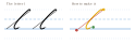
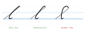
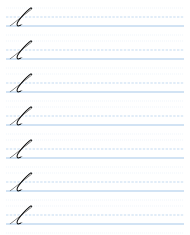
The next letter is l, and I'm going to spend quite a lot of time talking about this letter, because it's a very difficult letter to draw.
So we start off with our upstroke, just as though we were making an i, but we keep going much, much further up than the i, still in a straight line, on the same angle. This is the tricky part. So we go up, and we go up again. And then, when we get to the height of the top of the l, we bring our line back, but not too far, to make a loop. And this loop is quite thin. And then we come down almost straight: not quite straight, but not with too much of a curve. It's a tricky thing to do, because you can't make it completely straight; it's very hard to do that. But it's a slight curve. And then we cross it quite low down. It crosses pretty much where the top of an i would be. And the last part is just like the bottom part of an i, coming down and then flicking away. So it's like a very curious kind of very tall i with a loop on the top.
And the loop shouldn't be too big. If it's too big, it looks silly. If it's too thin, that's okay. And if it's a medium thickness loop on the top, that's okay too. But don't make it massive.
Cursive — Part One: The Small Letters · Evan Millner · Published by Abecedaria Press