

Lesson 21
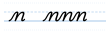
The example for practising our letter n is from the printed typeface, and looking at it, you can already tell me what's not so good about it. This is why it's quite good to develop an eye for these things. As you can see, the upstroke is not straight. When you do your upstroke, you will make it straight.
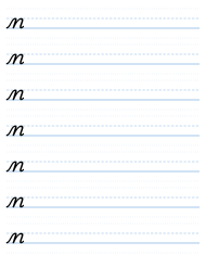
So: light up, and then we curve and come straight down, just as if we were making the letter i. And then we come back up, and just before we get to the top, we move forwards, as if we were making the top of a letter c. And we bend it down, and come down, and make another i again. Bring it down, and at the bottom we tick forwards. Make sure that these two downstrokes are parallel, that they're lined up. You can check that, of course, with your ruler, by putting some lines through it to see that they do line up. And that is the letter n.

It's not a complicated letter. Light up, dark down, light up, and then dark as we curve down to the second stroke, so the part that joins the two strokes is a little bit lighter. So: light up, dark down, light up, dark down, light up.
Cursive — Part One: The Small Letters · Evan Millner · Published by Abecedaria Press